I spoke with a few people about SharePoint (I don’t care about the edition at this moment too much) and when I say „it looks sexy“ nobody knows what I mean. So, take a look.
Microsoft Windows SharePoint Services
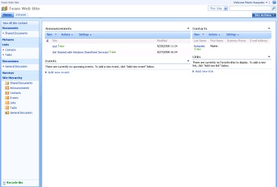
Decent text, just a few colors, a lot of white space, plenty of space for all the information I need. I can get a lot of announcements there as well as contacts, links and so on.
Lotus Quickr
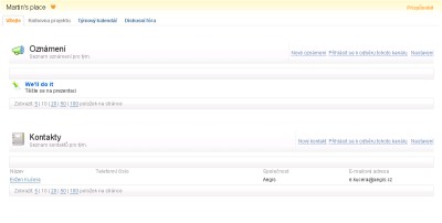
Colors, a lot of fonts and almost no space for the data I need. I was able to get just few announcements and some contacts on the page (even I have high screen resolution).
I know, it is possible to change the layout, but when you compare the default one, which one looks better? At least WSS doesn’t need Java 🙁
@4 which means it looks really nice 🙂